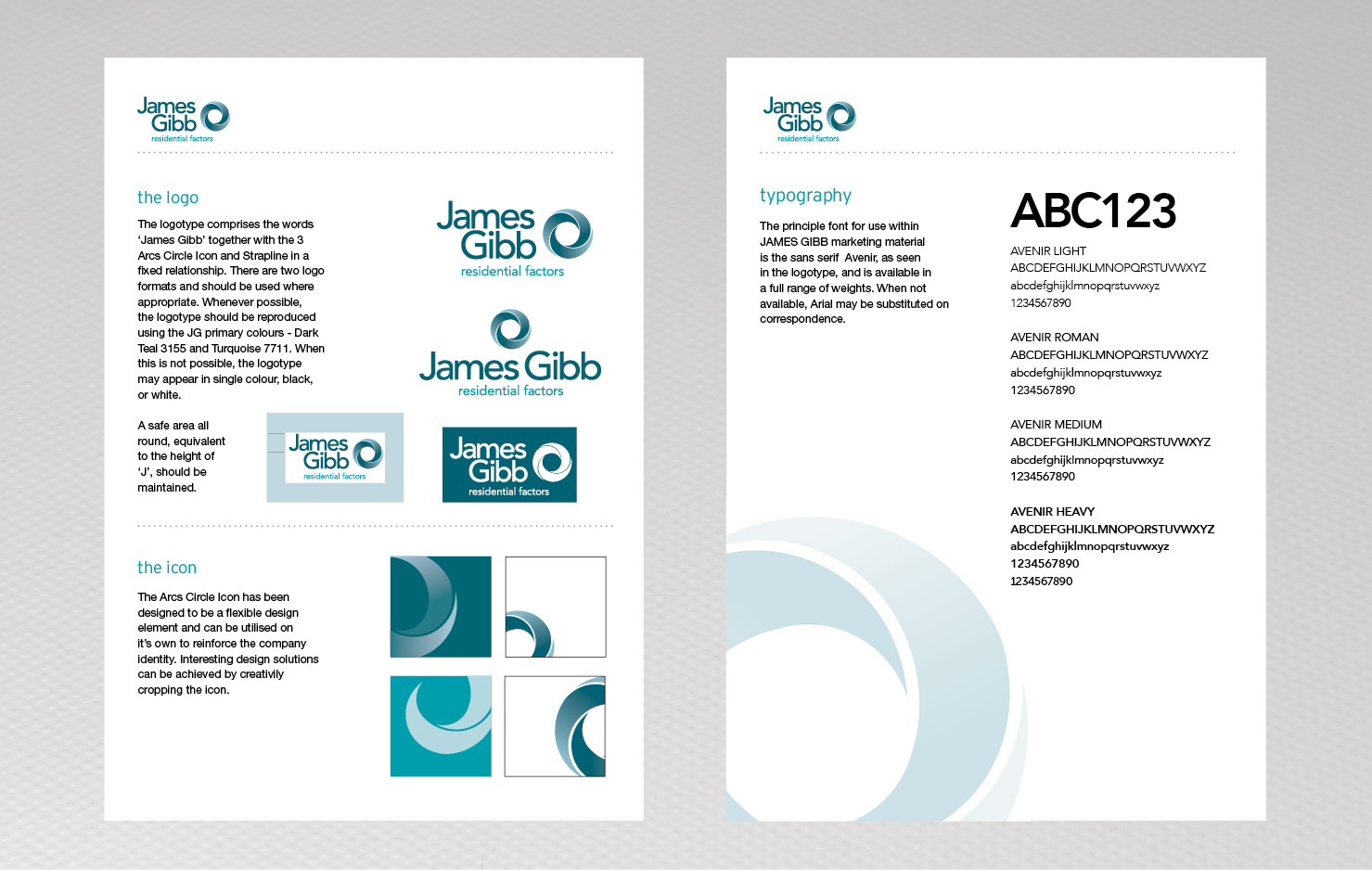
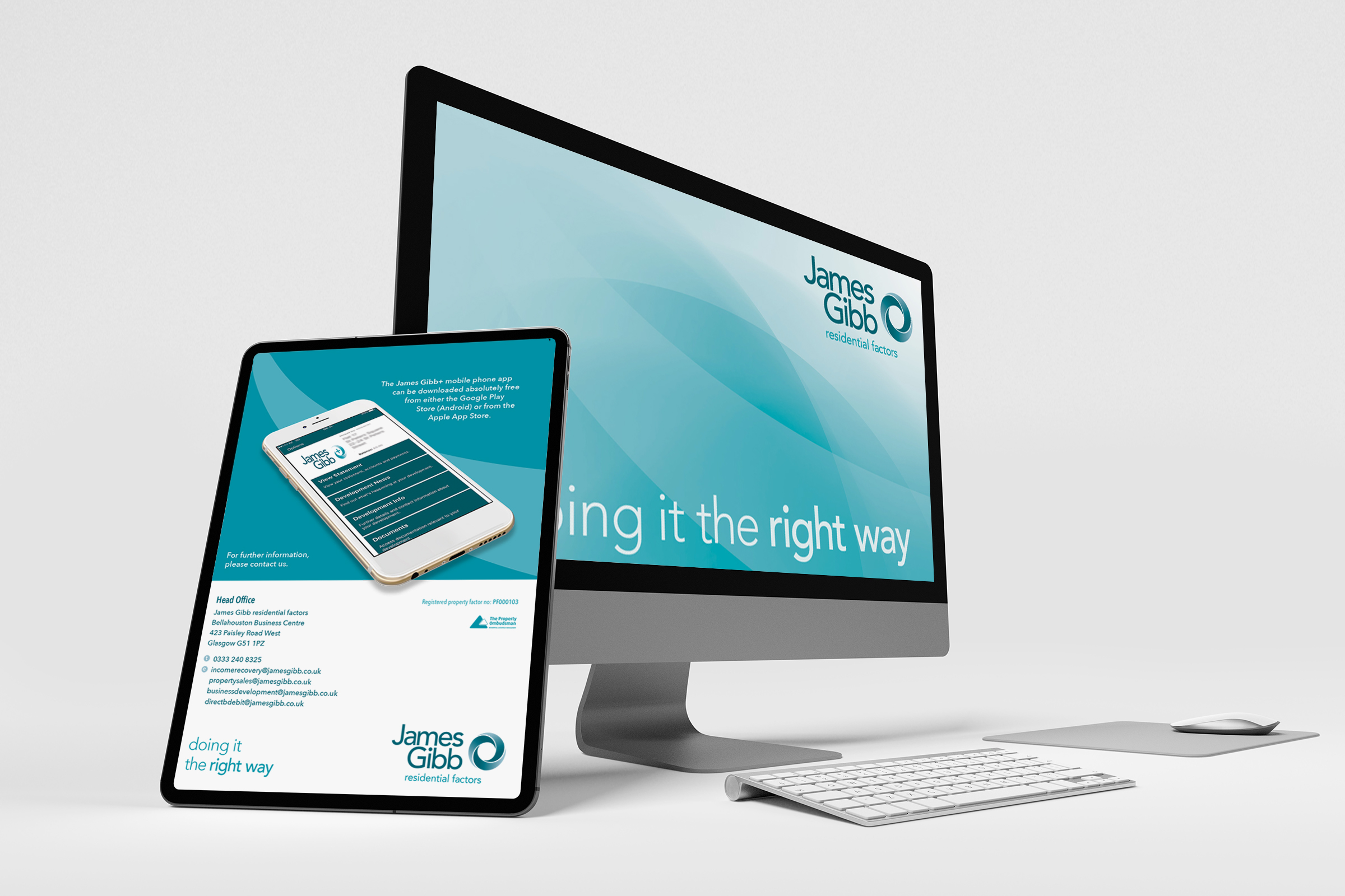
The James Gibb name has been well known since 1872. Back in 2012 Lennon Design was approached to create a 21st Century identity for this long established business that reflected their ethos – good, strong, traditional values with a modern twist. The solid, stacked design with simple block motif was enthusiastically received by both customers and employees and proved very successful. Now in 2020, we find the company had grown hugely in scale and they wanted to refresh the brand; integrating elements from a large company it has recently taken over and projecting a confident fresh new look. Lennon Design was honoured to be invited again to create the new branding style. Contemporary dynamic arcs and circles were the recognisable features of this new design, and an intense period of work saw the new identity utilised on stationery, merchandising, office signage, customer facing publications, website and vehicle livery.
What the client said…
It has been truly enlightening working with Alan on our new logo, brand, image and direction. He has been inspirational in his ideas and advice and I am hugely grateful for his help in guiding us to our new identity
DOUGLAS C. WEIR Managing Director, James Gibb residential factors.